

7 Tips for creating a PowerPoint Presentation
PowerPoint Presentations can be a useful tool and also a huge boredom flag!

The writing appearing in a PowerPoint Presentation is different than that you would normally use to present ideas. For example, sometimes you are given pages to fully explain your ideas if you’re writing a paper or even a blog post. PowerPoints are limiting.
So here are some tips I picked up on writing PowerPoint presentations through research and creating one that is not for an academic purpose for the first time.
1. Look at good examples
I would say that it was rather useful to look at an example of a good speaker and their presentation before I started working on creating a presentation of my own. The example that was given several times in the articles I found during my research was Steve Jobs. I would also recommend checking out some presentations on TEDtalks. These presenters are natural speakers, they didn’t use notes or a script to read from. Either they know their topic through and through and can run with it, or they practiced their speech so many times that they memorized it.

2. Organize your information into parts
I was able to separate my slides into a beginning, middle and end. This doesn’t necessarily mean you should have a slide called “Introduction/Outline” and one called “Summary/Conclusion”. These are like holding up big warning signs for impending boredom. For example, the introduction for my presentation is about me so I titled my slide “Nicole Basaraba who?” It still gets the message across, but in a less formulaic way, i.e. better PowerPoint writing?
3. Writing the content: Use LESS text and no bullet points if possible
I read one article that advised to not use any bullet points period! And if you look at Steve Jobs and TEDtalks presentations, there is rarely, if ever, a bullet point used. Keep in mind these people are professional speakers though. Since I’m a novice, I did use bullet points in some of my slides, but I tried to keep the content as short as possible.
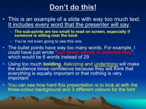
My rule of thumb would be: the bullet point should not go over ONE line at regular font size for a presentation (20-24 pt, 28pt is better). That means about 5-7 words per bullet. This highlights the key points and requires you to speak to fill in the blanks. The worst PowerPoints are the ones with the full text on the slide and the presenter just stands there and reads. ZZZZzzzzzzzzzzz
4. Use visuals, images, videos
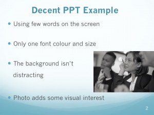
When applicable, I used photos to represent the points I was going to make instead of text. I think images immediately speak to people and text takes longer to absorb because the person has to read it and then process it. I have some slides that have visuals only. The others that require bullet points, also have some photos to maintain viewer interest. Clip Art isn’t the best option. It looks, for the most part, unprofessional and also not very engaging due to its cartoon-like or sktech-like appearance. Also, chances are the audience has seen these images before and thus they are less intriguing. Not to say Clip Art can’t be utilized or that audiences don’t enjoy cartoons, but try to use photos, nice-coloured graphs, charts or maps.
I also managed to include two short videos in my presentation which (a) gives the audience something to watch (most people like TV), and (b) you get a chance to stop talking, have a drink of water and breathe.
5. Theme/design
PowerPoints are notoriusly known to have a number of options for changing background colours, font colours and size, etc. Generally speaking, text is easier to read in a neutral colour (black, gray, navy blue, beige) and stands out better on a light coloured background. If you’re presentation is image heavy, images tend to stand out better against a dark background so that they POP out.
Presentations with dark backgrounds and colourful text are the hardest to read and are not pleasant to look at. Try to stick with three colours total. One or two background colours and one colour for the font (two if using the background colours). Also try to use two font sizes maximum. One size for the headings and one size for the body text. Only use bold, italics or underlining when absolutely necessary. Bulleted text with half of it bolded, italicized or underlined looks messy and also makes the audience think that that nothing is more important than something else because everything is apparently important (as it should be because it is already condensed into key points). Therefore, only highlight very important words (i.e. definitions/terms, warnings, negations, etc.)
6. Don’t stay on one slide for too long
Sometimes there will be a key point you want to make that has several aspects or sub-points. When possible, split these sub-points up onto several slides. If you stay on one slide, the audience will perceive that you are talking about this one topic forever and will start to get bored and tune out. So even if you have to talk for quite a while on one topic, try to split it up visually so the audience feels the progression of the presentation rather than feeling stalled on one point.
7. Give visual or verbal cues as to how much father you have to go
People like to know where they’re going, and if you make it easy for them to follow along as to whereabouts you are in the presentation, they will be more relaxed and more likely to pay closer attention. If you’re presentation is split up into parts, you may verbally state that you are now moving on the the second or last part of your presentation, for example. Or if you have many slides, you could visually include numbers like (slide 5 of 21). People have been trained on how to watch movies and there are cues presented that lets viewers know where they are in the story. This same theory can be applied to a presentaion, if they can see they are on slide 5 of 21, they know where they are and how much is left to go.
Did I miss anything? Were these helpful? Do you have any other tips on how to keep powerpoint presentations succinct, engaging and visually pleasing?